Visual research board / actual screenshots and scans
Y2K is four different beasts, not one chrome blob.
Started from live screenshots and scans instead of hand-wavey nostalgia: 2Advanced, Jamiroquai, Fly TV, Electric Sheep, Whole Earth Catalog, and a DNA Lounge flyer. This board is here to sharpen the art direction before we make the next truly deranged microsite pass.
What the visual evidence says
Not one Y2KThe references split into at least four different branches: industrial Flash futurism, music-promo portal, youth-broadcast candy vector, and indie creator cyber-pop.
Authenticity comes from structureThe real era signal is fixed-canvas composition, embedded nav objects, tiny utility copy, and sincere multimedia ambition — not just chrome gradients.
Motion is everywhereEven the still screenshots feel like paused intros: scan lines, diagonal thrust, radial bursts, streaks, arrows, and layered panels all imply animation.
Dense surfaces beat polite minimalismAuthentic pages use labels, badges, tabs, utility links, and image fragments aggressively. Empty cleanliness usually reads modern, not Y2K.
Immediate art-direction rules
- Industrial Flash Y2K: fixed-width shell, metallic rails, deep blue, micro-label nav, status widgets, implied audio/motion.
- Music promo Y2K: cool-blue media tunnel, button clusters, diagonal image crops, localization flags, promo strip energy.
- Broadcast candy Y2K: pastel gradients, outlined bubble type, overlapping circles, arrows everywhere, visible content overload.
- Indie cyber-pop Y2K: illustrated mascot, diagonal display type, weird taxonomy labels, translucent capsules, personal-web weirdness.
- Crossovers to keep pushing: Whole Earth for systems/editorial rigor; DNA Lounge for black-neon flyer density and raw venue utility.
Reference set
2000
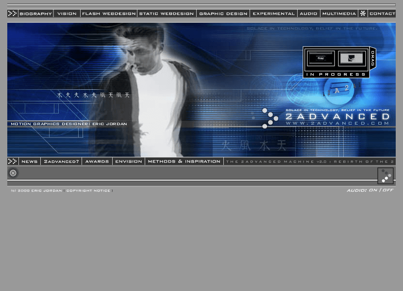
industrial flash futurism
Web Design Museum
This is a live visual reference, linked directly to the source page. The point is to study actual composition, not just describe a vibe.
- fixed-width machine shell
- electric blue + steel palette
- micro-label nav and status panels
- motion implied by scan lines, blur, and HUD layering
2003
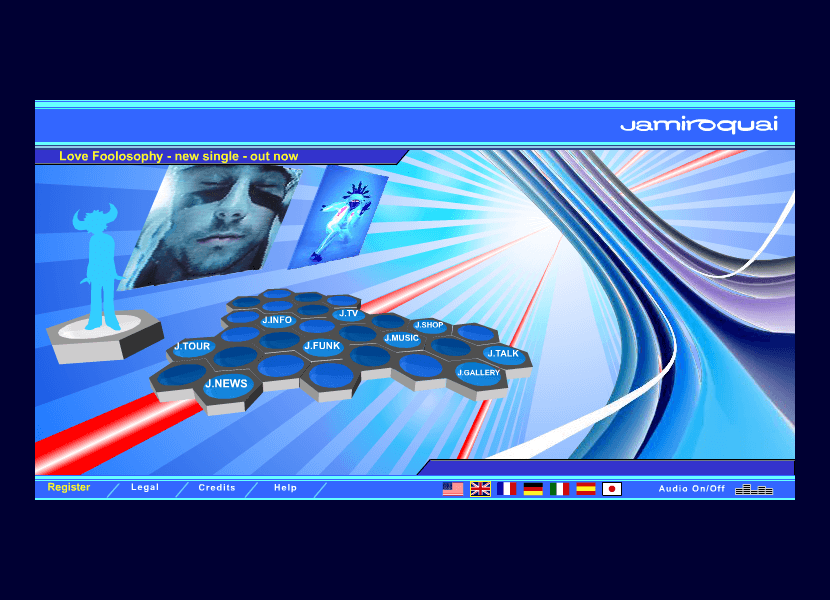
music promo portal
Web Design Museum
This is a live visual reference, linked directly to the source page. The point is to study actual composition, not just describe a vibe.
- cool-blue media tunnel
- hex-button navigation as object
- angled image cards
- earnest multimedia-brand futurism
2001
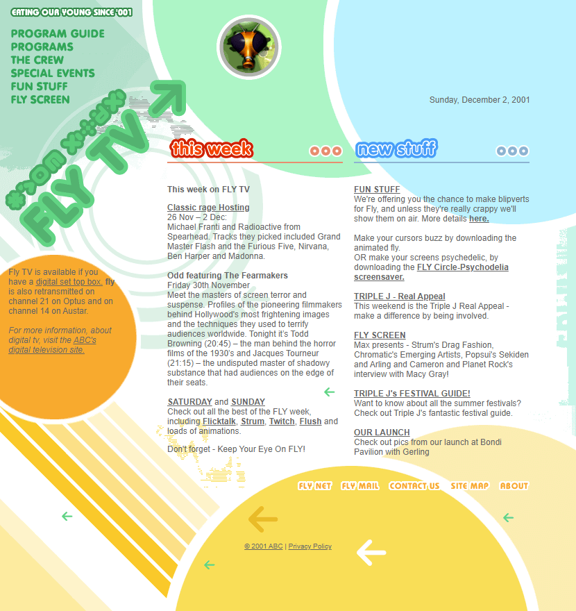
broadcast youth portal
Web Design Museum
This is a live visual reference, linked directly to the source page. The point is to study actual composition, not just describe a vibe.
- pastel vector gradients
- navigation overload as energy
- bubble/outlined type with pseudo-3D depth
- screen-like halftone and scan textures
2003
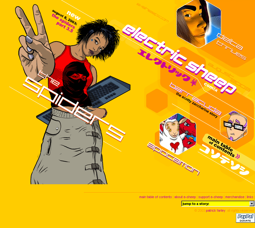
indie creator cyber-pop
Web Design Museum
This is a live visual reference, linked directly to the source page. The point is to study actual composition, not just describe a vibe.
- illustration-first splash page
- saturated mono-background
- outlined diagonal headline
- floating translucent techno-panels and portal thumbnails

Fall 1970
systems-catalog counterculture
Internet Archive via wholeearth.info
This is a live visual reference, linked directly to the source page. The point is to study actual composition, not just describe a vibe.
- vast negative space on the cover
- weighty serif type
- symbolic image used sparingly
- editorial authority over commercial hype
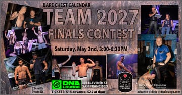
2026
club-poster collage density
DNA Lounge
This is a live visual reference, linked directly to the source page. The point is to study actual composition, not just describe a vibe.
- dark base with white/silver promo type
- photo-collage framing
- venue metadata always visible
- raw nightlife proof over polish
How to go crazier without going generic
- Pick one Y2K branch per page. Don’t mix 2Advanced shell logic with Fly TV candy vectors unless the collision is intentional.
- Design the navigation object first. In authentic Y2K, nav is part of the spectacle.
- Leave in tiny utility text, badges, audio toggles, date stamps, footer junk, and strange labels. They sell the era.
- Use motion cues in static layout: rays, diagonals, rings, scan lines, stacked buttons, floating frames.
- When we pivot to rave/club pages, favor poster density and event metadata over elegant spacing.
Best next experiments
- 2Advanced shell remake: hard blue machine chassis with modular content viewport.
- Fly TV portal remake: pastel-broadcast chaos, circular zones, giant bubble labels, TV-guide energy.
- Electric Sheep indie portal: illustration-led cyber-pop with weird taxonomy and portal thumbnails.
- DNA Lounge x Y2K collision: black venue utility shell plus overstuffed event collage and metallic hero type.
- Whole Earth x Y2K mutant: catalog taxonomy and annotation density inside a futuristic interface frame.